http://www.farlowstudios.com/tutorials.html
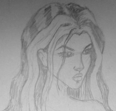
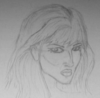
I was always into drawing cartoons as a kid, and I still enjoy sketching occasionally, though ultimately I don't have the patience to produce anything particularly good. These tutorials are fantastic, though, especially if you want to draw the female form in a comic-book style. So needless to say, they distracted me from my real purpose - icon design - for a good few hours. They just give a good overview of getting the proportions right. For instance, when I sketch a face freehand, I always have problems getting the size of the eyes to match when drawing the face at an angle. The tutorial on faces (http://www.farlowstudios.com/femalefaces.html) really helped, though. This is what I came up with:
Anyway. As far as the icons go, I ended up playing around in PhotoShop with layer style settings, gradient fills and the shape tool, and after nearly a week's work, I have finally managed to put together the icon set that I will use for Scrivener 1.0 (a few of the icons are just modified common Apple icons):
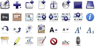
The only one I'm not 100% certain about is the binder icon, which doesn't sit at the right angle if you're going by the Apple Human Interface Guidelines (it's sloping backwards when it should be sitting straight, as though sitting on a shelf). I'll probably leave it for now, though - I really have to get onto rebuilding the interface, and I don't want this thing to get stuck in development hell forever.
Mmmm ...
ReplyDeleteNot sure about the highlighter icon. Looks a bit flat.
I think it might look better in action. It was actually Photoshopped from a photo of a highlighter pen, so I don't think it looks too flat, though of course I'm biased.
ReplyDeleteI'm not sure about that dark blu colour, which seems a bit harsh, a bit severe, a bit cold, a bit imperative to me.
ReplyDelete